General Reporting Features
General Tools
In addition to the standard navigation, various tools are used throughout the site to search for, select, and display information.
Selection Tools
Drop-down Lists
Drop-down lists allow users to choose one item from a list. CERS uses multiple types of drop-down lists to present and organize information.
Basic Drop-down Lists
The basic drop-down list contains a short list of fixed information to allow easy and predictable navigation. Select the search field to access the list (figure 1).
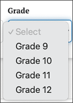
Figure 1. Sample Drop-Down List
Drop-down List with Search
Some drop-down lists may have hundreds or thousands of items. In those cases, a search field allows users to type in a keyword to filter the list of items. The filtered list includes all items that contain the keyword, so a search term of “oak” would match “Oak Persimmon School,” “Elaenia Oak School,” and other schools with “oak” somewhere in the name (figure 2).
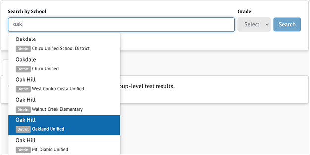
Figure 2. Sample Drop-Down List with Search
Dependent Drop-down Lists
Dependent drop-down lists are two or more related drop-down lists in which a value must be selected in the first drop-down list before the second drop-down list is selectable. The following example of a Search by School is available for school and district administrators within CERS (figure 3 and figure 4). In this example, the user must select a school name before selecting the grade.
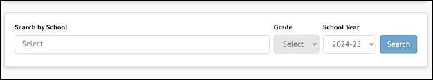
Figure 3. Sample Dependent Drop-Down List
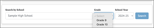
Figure 4. Sample Dependent Drop-Down List with Selectable List
Live Search
Some input fields include “live search,” in which matching results are displayed as the user types. In the following example (figure 5), the value entered retrieves matches from anywhere within the group name.
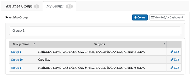
Figure 5. Sample Live Menus
Context Menus
Context menus provide additional options for a button or icon (figure 6 and figure 7). For example, when users select the [Printable Reports] button, a context menu pops up with the ability to filter by School Year, Assessment Type, Subject, and sort by one of the Sort Order drop-down list values (e.g., Student Name).
![The [Printable Reports] button.](/s/cers-guide/general-reporting-features/2025-5a-image006.png)
Figure 6. Printable Reports Button
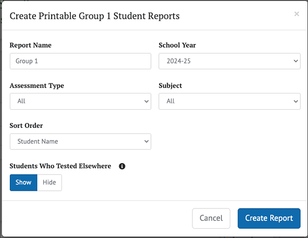
Figure 7. Sample Context Menu
When users select the Context Menu three-dot icon [⋮] next to a student’s name, a small context menu displays additional links specific to that student (figure 8).
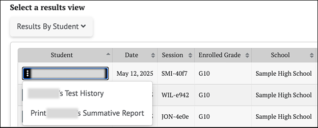
Figure 8. Sample Context Menu with Drop-Down List Options Shown
Buttons
Selectable Buttons
Selectable buttons may appear in different colors, depending on the purpose of the button. Typical buttons have a blue background and send or retrieve information when selected. If required information is missing, the button will be disabled, in which case it will not be selectable. To enable the button, provide the required information in the associated text field(s) or drop-down list(s). An example of a disabled button (dimmed) is shown in figure 9, and a selectable button (bright) is shown in figure 10.
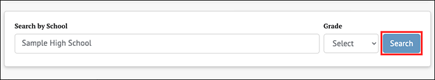
Figure 9. Sample Selectable Button Disabled
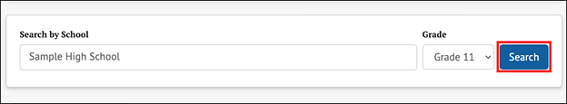
Figure 10. Sample Selectable Button Enabled
Toggle Buttons
Some values and data types can be displayed in different formats and view preferences. For these content types, there is a display toggle button for each option. Select the button associated with the preferred format or view preference. In the following examples shown in figure 11, the currently selected value is shown with either a gray or blue background.
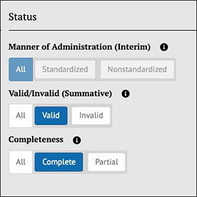
Figure 11. Sample Toggle Buttons
Advanced Filters
Assessment results have an advanced filtering capability that uses a variety of toggle buttons to allow users to select what to display in a report. As with toggle buttons, select the value to display; selected values are shown with a blue background (figure 12).
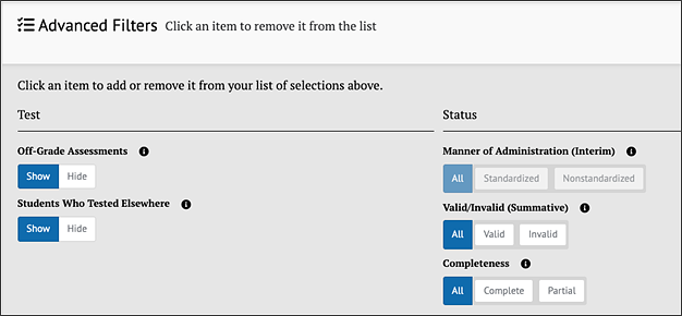
Figure 12. Advanced Filters Buttons
Display Tools
Column Ordering
Some tabular data contains columns a user can reorder. Column ordering control allows the user to move any selected column left or right to reorder the columns as desired. Examples are shown in figure 13 and figure 14.
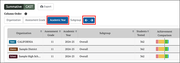
Figure 13. Column Ordering Control
In this example, if the user selects the [Academic Year] button and then selects the [Left Arrow] button twice, the tabular data will appear as shown in figure 14.
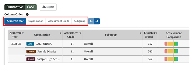
Figure 14. Column Ordering Control with Change Shown
Columns can also be reordered by simply dragging and dropping them with the mouse (select the column button, hold, drag, and release).
Sorting
Tabular data are presented with column headers, and any sortable column displays both an up and down arrow. Select a column name to sort by that column and select it again to reverse the sort order. The sorted column displays either an up or down arrow indicating its sort order. In figure 15, the results are sorted in ascending order by the students’ last names.
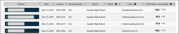
Figure 15. Column Sorted in Ascending Order
Expanding and Collapsing
Expanding some pages, like the group results page, will display information collapsed or hidden by default. An arrow icon pointing downward indicates to users that information on the page can be expanded. Figure 16 displays a down arrow icon [⌄] next to [Expand All] and [Show Results]. When [Expand All] is selected all results for the selected assessments will be displayed. When [Show Results] is selected within a specific assessment results section, the results for the assessment will be displayed.
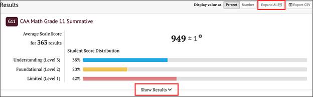
Figure 16. Downward Arrow Icons to [Expand All] or [Show Results]
An arrow icon pointing upward indicates to users that information on the page can collapse. Figure 17 displays the upward arrow icon [⌃] next to [Collapse All] and [Hide Results]. When [Collapse All] is selected the results for all selected assessments will collapse. When [Hide Results] is selected within a specific assessment results section, the results for the assessment will collapse or be hidden.
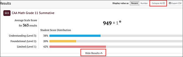
Figure 17. Upward Arrow Icons to [Collapse All] or [Hide Results]
Add and Remove Icons
Elements with a [Remove] “x” icon [⨉] can be removed by selecting the icon. When it is possible to add elements to a list, the [Add] plus sign “+” icon [+] appears next to the list. Select the icon to add a new element to the list. Examples of the icons are shown in figure 18.
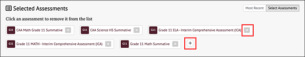
Figure 18. Sample [Add] and [Remove] Icons
Informational Icons
Whenever an [Informational] lowercase “i” icon [ ] is displayed, users can select it to display an explanation of the term it accompanies (figure 19). For example, when selecting the icon next to a table column, a pop-up displays additional information.
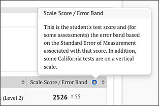
Figure 19. Information Icon
Other Tools
Exporting and Downloading
Users may export certain reports to a file in comma-separated value (CSV) format by selecting the [Export CSV] button (figure 20).
![[Export CSV] button.](/s/cers-guide/general-reporting-features/2025-5a-image021.png)
Figure 20. [Export CSV] Button
Some screens in the application allow users to download reports. Figure 21 shows an example of downloading a report to the user’s computer by selecting the Download Report Data menu option from the My Reports page.
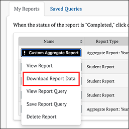
Figure 21. Download Report Data Option
The location of exported and downloaded files is dependent on the web browser and the user’s settings. Please refer to the web browser’s user guide for more information.